
Kore Design System
//2024
//MOBILE DESIGN SYSTEM
ROLE:
/Lead Product Designer
METHODS:
/Stakeholder Trade-off
/Design Tokens
/Component Semantics
/Design System
How Design Systems and design management scale up the operations. More delivery with less.
OUTCOMES:
/4,9 Store Rate
/+16 Clients
Kore is an initiative from Kobe Apps aimed at scaling operations.
I was the primary manager who drove the idea to implementation. The focus was on achieving consistency and scaling up the e-commerce SaaS product.
see the product

team:
/Lead Product Designer
/2 Product Designers
/2 Mob Engineer
/1 Tech Lead

01・challenge
/How can we develop and promote a new Design System to maintain client's brand consistency?
02・product process
//define DS structure
how design tokens and components will work
//make a POC
create a prove of concept of multi-brand design system structure
//pitch the cost
evaluate the cost of building it and pitch to stakeholders
//DS structure
A shared language between design and code is essential. Semantics is the key for everyone to speak the same.
Our objective was to design and establish our shared language.
_dev base

_code base
_semantics

<blue.umbrela>
_design base

_design file
//POC tokens structure
We started from Design Tokens and main components to translate the brands.

_color tokens

Aa
Aa
Aa
_typo tokens

_style tokens

Label
<PRIMARY.BUTTON>
Tokens/container:
background color = primary-color
padding = padding-sm
Tokens/label:
typography = button
color/active = on-primary-color
color/disabled = primary-dark-color
icon: optional
Label
<PRIMARY.BUTTON>
Tokens/container:
background color = primary-color
padding = padding-sm
Tokens/label:
typography = button
color/active = on-primary-color
color/disabled = primary-dark-color
icon: optional
Label
<PRIMARY.BUTTON>
Tokens/container:
background color = primary-color
padding = padding-sm
Tokens/label:
typography = button
color/active = on-primary-color
color/disabled = primary-dark-color
icon: optional
//pitch the costs
_usernav
/how to convince stakeholders?
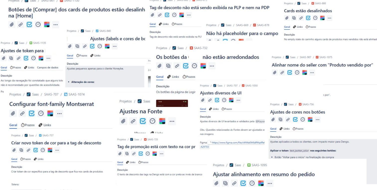
I evaluate all costs of open tickets related to token adjustments.
We then compare this cost to building new components.
Simple math.
//results
Total stylized
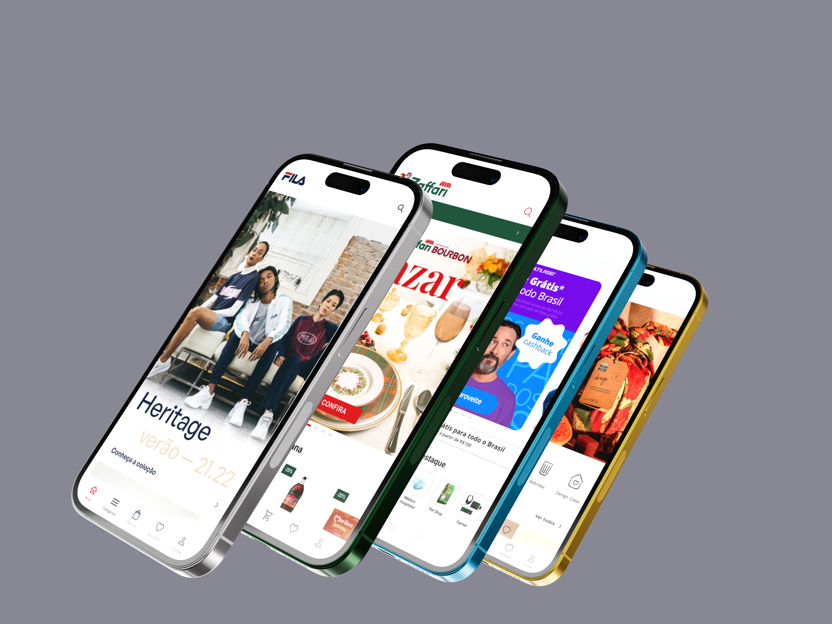
Changing design tokens on the fly allow to switch brands
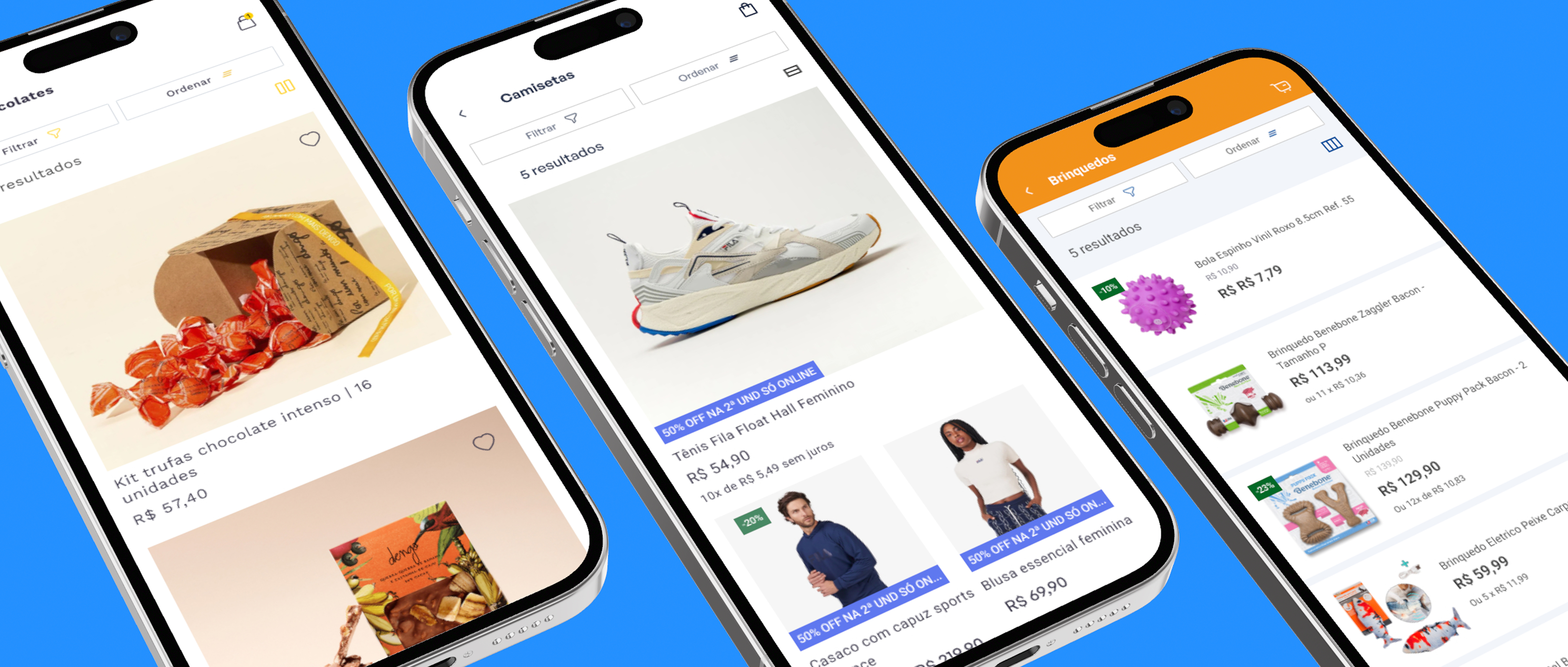
Product feature-centric
Scale was the key word. The Design System should support product's features and brand's use at same time.
Central Components
Our library maintain central components with variations, to apply on brands.
_outcomes
4,9 Apps Score in Store
+16 Brands with same team

//daily manager
sofie.status:
just wake up - demanding walk
food.approval:
approved
uptime:
7y 6m - approval rate: 94%
//contact
linkedin.com/in/leormuller
porto alegre, Brazil - utc-3
Kore Design System
//2024
//MOBILE DESIGN SYSTEM
ROLE:
/Lead Product Designer
METHODS:
/Stakeholder Trade-off
/Design Tokens
/Component Semantics
/Design System
How Design Systems and design management scale up the operations. More delivery with less.
OUTCOMES:
/4,9 Store Rate
/+16 Clients
Kore is an initiative from Kobe Apps aimed at scaling operations.
I was the primary manager who drove the idea to implementation. The focus was on achieving consistency and scaling up the e-commerce SaaS product.
see the product
team:
/Lead Product Designer
/2 Product Designers
/2 Mob Engineer
/1 Tech Lead

01・challenge
/How can we develop and promote a new Design System to maintain client's brand consistency?
02・product process
//define DS structure
how design tokens and components will work
//make a POC
create a prove of concept of multi-brand design system structure
//pitch the cost
evaluate the cost of building it and pitch to stakeholders
//DS structure
A shared language between design and code is essential. Semantics is the key for everyone to speak the same.
Our objective was to design and establish our shared language.
_dev base
_code base
_semantics
<blue.umbrela>
_design base
_design file
//POC tokens structure
We started from Design Tokens and main components to translate the brands.
_color tokens
Aa
Aa
Aa
_typo tokens
_style tokens
Label
<PRIMARY.BUTTON>
Tokens/container:
background color = primary-color
padding = padding-sm
Tokens/label:
typography = button
color/active = on-primary-color
color/disabled = primary-dark-color
icon: optional
Label
<PRIMARY.BUTTON>
Tokens/container:
background color = primary-color
padding = padding-sm
Tokens/label:
typography = button
color/active = on-primary-color
color/disabled = primary-dark-color
icon: optional
Label
<PRIMARY.BUTTON>
Tokens/container:
background color = primary-color
padding = padding-sm
Tokens/label:
typography = button
color/active = on-primary-color
color/disabled = primary-dark-color
icon: optional
//pitch the costs
_usernav
/how to convince stakeholders?
I evaluate all costs of open tickets related to token adjustments.
We then compare this cost to building new components.
Simple math.
//results
Total stylized
Changing design tokens on the fly allow to switch brands
Product feature-centric
Scale was the key word. The Design System should support product's features and brand's use at same time.
Central Components
Our library maintain central components with variations, to apply on brands.
_outcomes
4,9 Apps Score in Store
+16 Brands with same team

//daily manager
sofie.status:
food.approval:
approved
uptime:
7y 6m - approval rate: 94%
//contact
linkedin.com/in/leormuller
porto alegre, Brazil - utc-3